Paint color · Sherwin-Williams gray
Mindful Gray (SW 7016): A Mid Gray with Presence
Published
Mindful Gray (SW 7016) is a balanced mid gray with a little warmth, deep enough to read clearly as gray even in strong Arizona light. It is the color to try when Repose Gray or Agreeable Gray look too pale on your walls or your house.
Its hex is #BCB7AD. We calculate its light reflectance at about 48 from the RGB values, so it reflects a bit under half of the visible light that hits it. That depth gives it presence, and it also means a sunny wall will run warmer than with the lighter grays.
Color swatch: Mindful Gray SW 7016, #BCB7AD
| Code | SW 7016 |
|---|---|
| Hex | #BCB7AD |
| RGB | 188, 183, 173 |
| LRV | About 48, our own calculation from the RGB values (not Sherwin-Williams' figure) |
| Color family | Balanced mid gray with mild warmth |
A true mid gray, gently warm
Mindful Gray steps down 15 points from red to blue, with red and green close together. That is a familiar pattern for a warm gray, but here it comes at a deeper level: every channel is roughly 15 to 20 points below Repose Gray. The result is a gray that looks solid and settled rather than airy.
Its undertone is fairly neutral. It rarely shows the violet some see in lighter grays, though in very cool light it can look slightly green-gray, and in warm light it drifts toward greige.
Because it has more pigment than a pale gray, Mindful Gray also covers dark old colors a little more easily, although a big color change still calls for spot-priming where needed and two full finish coats.
Why go deeper than Repose Gray?
Bright Arizona light lightens every color. A pale gray that looks right on a chip can look almost white in a sunny great room or on a south-facing stucco wall. Mindful Gray holds its color in those conditions, so the room or the house actually looks gray.
It is also a good choice when you have bright white trim, cabinets or tile and want enough contrast for them to stand out. With a pale gray, the white trim can blend in; with Mindful Gray, it reads clearly.
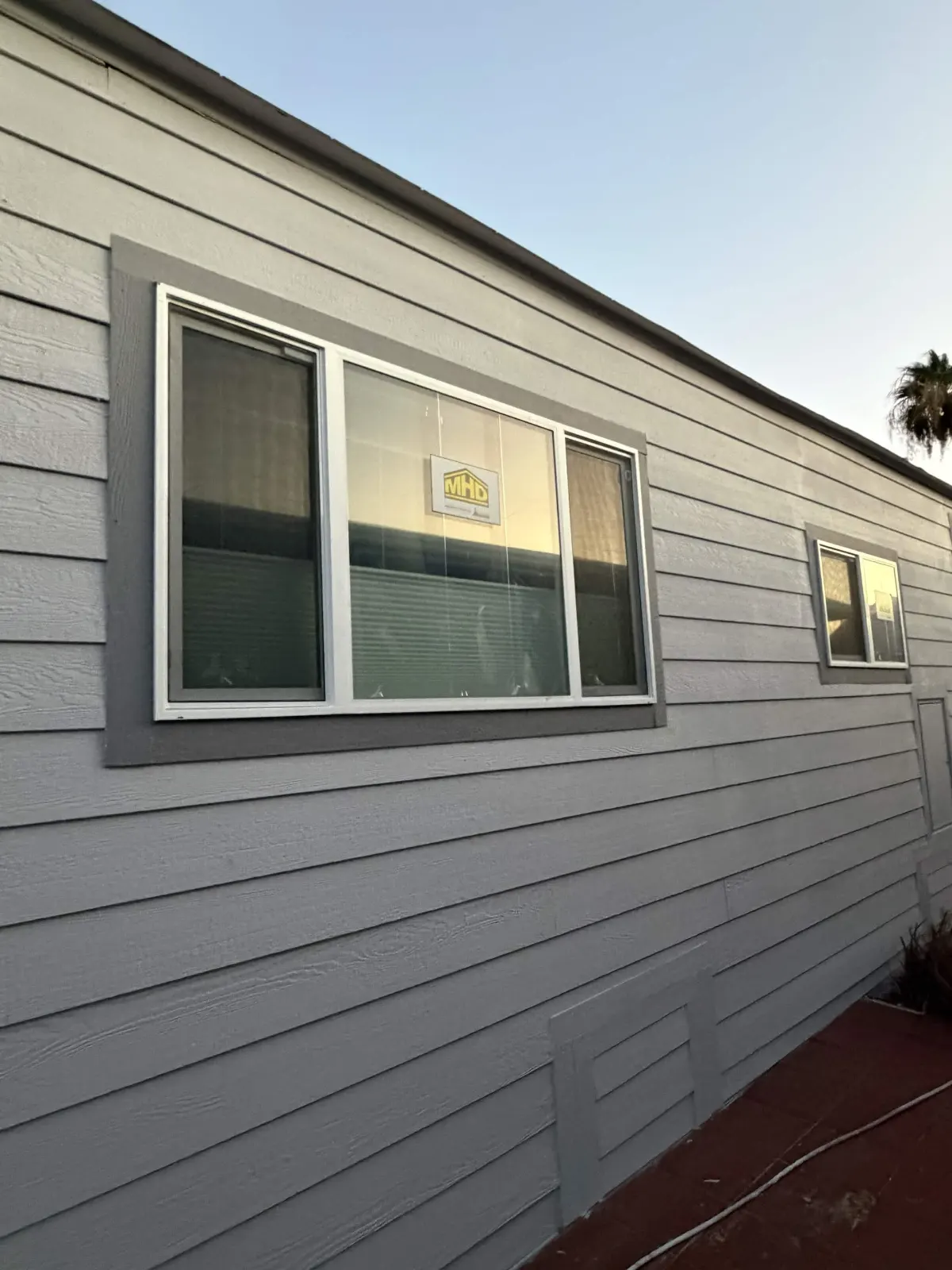
Mindful Gray on an Arizona exterior
As a stucco body color, Mindful Gray gives a house a grounded, modern look, especially with white or very light trim and black or bronze window frames. In full sun it looks noticeably lighter than the chip; in shade it reads as a solid mid gray.
It also works as the darker half of a two-tone scheme, with a light gray or off-white on the main body and Mindful Gray on pop-outs, columns, the garage door or a base band.
Heat and fading with an LRV near 48
LRV is the share of visible light a color reflects, from 0 to 100. At about 48 by our calculation, Mindful Gray absorbs more sunlight than the light grays and whites, so a west-facing wall in it will get warmer in summer. It is still far from the heat load of a charcoal or deep brown.
Mid-tone colors carry more tint than off-whites, so fading over several Arizona summers is a bit more noticeable, mostly as a slight lightening on south and west walls. A top-tier exterior paint with strong color retention, applied over sound prep, slows that down.
Mindful Gray indoors
- Large, bright rooms with big windows, where pale grays wash out.
- Accent walls behind a TV or bed when the rest of the room is a lighter gray.
- Home offices and dens where you want a cozier, enclosed feel.
- Cabinets and kitchen islands paired with white perimeter cabinets.
- North-facing rooms: be careful, as it can look heavy in low light.
Pairings for Mindful Gray
- Sherwin-Williams lists Eider White (SW 7014), SW 7009 and Homburg Gray (SW 7622) as coordinating colors.
- Eider White makes a soft trim; for crisper contrast, use Extra White (SW 7006) or Pure White (SW 7005).
- Homburg Gray is a deep green-gray with a calculated LRV near 15, well suited to a front door, shutters or a garage door.
- Other dark accents: Gauntlet Gray (SW 7019) or Iron Ore (SW 7069).
Sheen for a mid-tone gray
Deeper colors show sheen differences and touch-ups more than whites do. Inside, a consistent eggshell or satin across each wall helps, and we cut in and roll in a way that keeps the finish even. Trim and cabinets in semi-gloss or satin stand up to cleaning.
Outside, we use Sherwin-Williams Emerald Exterior in two coats, sprayed and back-rolled on stucco, with Loxon primer on bare or patched spots. Inside, we use low-VOC Emerald Interior.
How to test Mindful Gray
- Paint a large sample in the brightest and the darkest room where you plan to use it.
- For an exterior, check it on a south or west wall at midday and on a shaded wall.
- Place your trim white next to it so you can judge the contrast.
- If your neighborhood has an HOA, get approval before scheduling exterior work.
Frequently asked questions
- Is Mindful Gray darker than Repose Gray?
- Yes. Our calculated LRV is about 48 for Mindful Gray and about 58 for Repose Gray. Mindful Gray reads as a true mid gray.
- Is Mindful Gray warm or cool?
- It is a fairly neutral gray with mild warmth. It can lean slightly greige in warm light and slightly green-gray in very cool light.
- Will Mindful Gray make my exterior too hot?
- It absorbs more sunlight than a light gray, so a sunny wall will be warmer. It is still much cooler than a charcoal or deep brown.
- What trim color goes with Mindful Gray?
- Eider White (SW 7014) for soft contrast or Extra White (SW 7006) for crisp contrast. Both keep the gray looking clean.
- Is Mindful Gray too dark for a north-facing room?
- It can feel heavy in a small north room with little light. In that case a lighter gray like Repose Gray may suit better.
- What door color goes with a Mindful Gray house?
- Homburg Gray (SW 7622), a listed coordinating color, works well. Iron Ore (SW 7069) and Gauntlet Gray (SW 7019) are other options.
- Can Mindful Gray be used on kitchen cabinets?
- Yes, it is a popular depth for an island or lower cabinets with white uppers. It hides scuffs better than white and looks substantial next to wood or brass hardware, especially in a satin finish.