Paint color · Light neutral gray
On the Rocks (SW 7671): A Light, Balanced Gray for Arizona
Published
On the Rocks (SW 7671) is a light gray from Sherwin-Williams that sits very close to neutral, with only a faint warmth. Its LRV comes to about 62 when calculated from the RGB values, so it reflects most of the sun on an Arizona stucco wall and still reads as a clear, soft gray rather than an off-white.
That neutral balance makes it a dependable whole-house color, both outside and in, for people who want gray without obvious blue, green or beige.
Color swatch: On the Rocks SW 7671, #D0CEC8
| Color | On the Rocks |
|---|---|
| Code | SW 7671 |
| Hex | #D0CEC8 |
| RGB | 208, 206, 200 |
| LRV | About 61.7 (calculated from the RGB values) |
| Color family | Light gray, close to neutral with a faint warm cast |
Is On the Rocks warm or cool?
Its RGB values are 208, 206 and 200: red and green almost equal, blue a few points lower. On paper that is a very slightly warm gray. On a wall, most people see a clean, light gray, with the slight warmth keeping it from looking icy.
Context swings it. Next to bright white trim, it reads as a definite light gray. Next to a warm cream, it can look cooler, sometimes with a hint of lilac or blue in shade. That is not in the paint so much as in how our eyes compare neighboring colors.
How On the Rocks looks in desert sun and north light
In full midday sun, a light color like this one can nearly wash out to white on a south wall. That is actually helpful in Arizona, because it keeps the house from looking stark or flat-white while still being bright. In shade, it shows its gray more clearly.
In north-facing rooms, On the Rocks leans cooler and grayer, a good fit for offices and bedrooms that need a calm color without looking dark. Under warm white LEDs at night, it moves toward a soft greige.
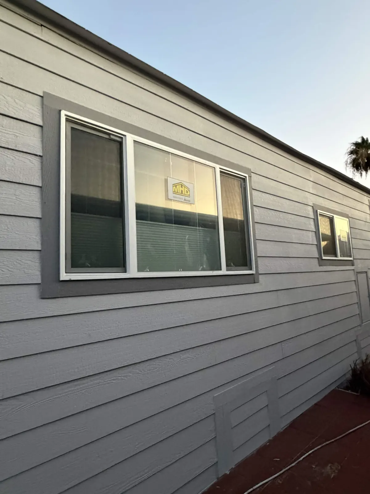
Where On the Rocks works on a house
- Whole-house exterior body on stucco or siding, with white trim and a darker door
- Interior walls throughout a house, as a light gray that is not stark
- Ceilings in rooms with mid-tone gray walls
- Cabinets in a light gray kitchen, especially with white or marble-look counters
- Garage doors on a medium gray body, where a lighter value breaks up a large surface
Colors that coordinate with On the Rocks
Sherwin-Williams lists Extra White (SW 7006) and Greek Villa (SW 7551) as coordinating colors for On the Rocks, together with SW 9105. Extra White is a crisp, clean white with an LRV of about 86; Greek Villa is a warmer white at about 84.
- Crisp, modern trim: Extra White (SW 7006)
- Softer trim for warm tile roofs: Greek Villa (SW 7551)
- Darker accent for shutters or fascia: Grizzle Gray (SW 7068) or Web Gray (SW 7075)
- Mid-tone gray for a two-tone house: Gray Matters (SW 7066)
What an LRV of about 62 means for heat and fading
On the Rocks reflects around 60 percent of visible light. That keeps sunlit stucco much cooler than a mid-tone or dark color, which reduces stress on the paint film, caulked joints and stucco in summer heat.
Fading is also less noticeable on light grays. Over time, the sunny elevations may get slightly lighter and chalkier, but because the color starts light and neutral, the change is subtle. Light colors do show dirt and red dust more, especially at the base of walls, so a gentle wash before repainting helps.
On the Rocks versus lighter and darker grays
If On the Rocks looks too dark in a dim room, a lighter neutral like Nebulous White (SW 7063) can give the same clean feel with more reflectance. If it looks too light outside in full sun, Gray Matters (SW 7066) is a mid-tone with a similar neutral to slightly green balance.
Compared with warm greiges, On the Rocks has less beige, so it pairs better with gray tile roofs, black windows and cool stone. With brown or terracotta tile, a warmer greige may look more natural.
Sheen and product for On the Rocks
For stucco, we use Sherwin-Williams Emerald Exterior, spraying and back-rolling two coats, and prime bare or patched stucco with Loxon masonry primer. A flat or low-sheen finish on the body keeps light colors from showing every patch.
Indoors, Emerald Interior in eggshell suits walls, with satin or semi-gloss on trim and doors. Light colors are more forgiving of touch-ups than dark ones, but sheen still has to match.
How to test On the Rocks
- Roll two coats on a big sample board.
- Check it on the sunniest wall at noon; if it vanishes to white, consider a slightly darker gray.
- Look at it next to your trim, roof tile, and window frames.
- Inside, compare it in a north room and a south or west room.
- If your community has an HOA palette, confirm On the Rocks or a close match is approved.
Frequently asked questions
- Is On the Rocks warm or cool?
- It is close to neutral with a faint warmth in its RGB values. Next to warm creams it can look cooler; next to bright white it looks like a clean light gray.
- Is On the Rocks a good exterior color in Arizona?
- Yes, at a calculated LRV of about 62 it keeps walls cooler and hides fading well. It may look almost white on a south wall at noon, which many homeowners like.
- What trim goes with On the Rocks?
- Extra White (SW 7006) and Greek Villa (SW 7551) are both listed by Sherwin-Williams as coordinating colors. Extra White gives a sharper edge, while Greek Villa reads softer and warmer.
- Does On the Rocks look purple?
- It does not contain much red or blue relative to green, but some light grays can look faintly lilac next to warm colors or in shade. Test it beside your cabinets, floors and roof.
- Is On the Rocks good for a whole-house interior?
- It is a flexible light gray for main living areas, hallways and bedrooms. In very dim rooms, a lighter color may keep the space brighter.
- Can On the Rocks be used on kitchen cabinets?
- Yes, it makes a soft light gray cabinet color that hides smudges better than white. A satin or semi-gloss sheen holds up to daily handling and wiping.