Guide · Interior color
Interior Colors Popular in West Valley Homes
By the Orange Coatings team · Published
The interior colors that work best in West Valley homes are warm whites, soft greiges, light warm grays and muted sage greens, with deeper charcoals, bronzes or navy saved for accent walls, doors and cabinets. They suit the strong desert light, they get along with the beige tile and travertine floors found in so many local houses, and they make rooms feel bright without looking stark.
Here are the color families that suit houses in Surprise, Peoria, Goodyear and nearby cities, with specific Sherwin-Williams colors to sample and the reasons they work here.
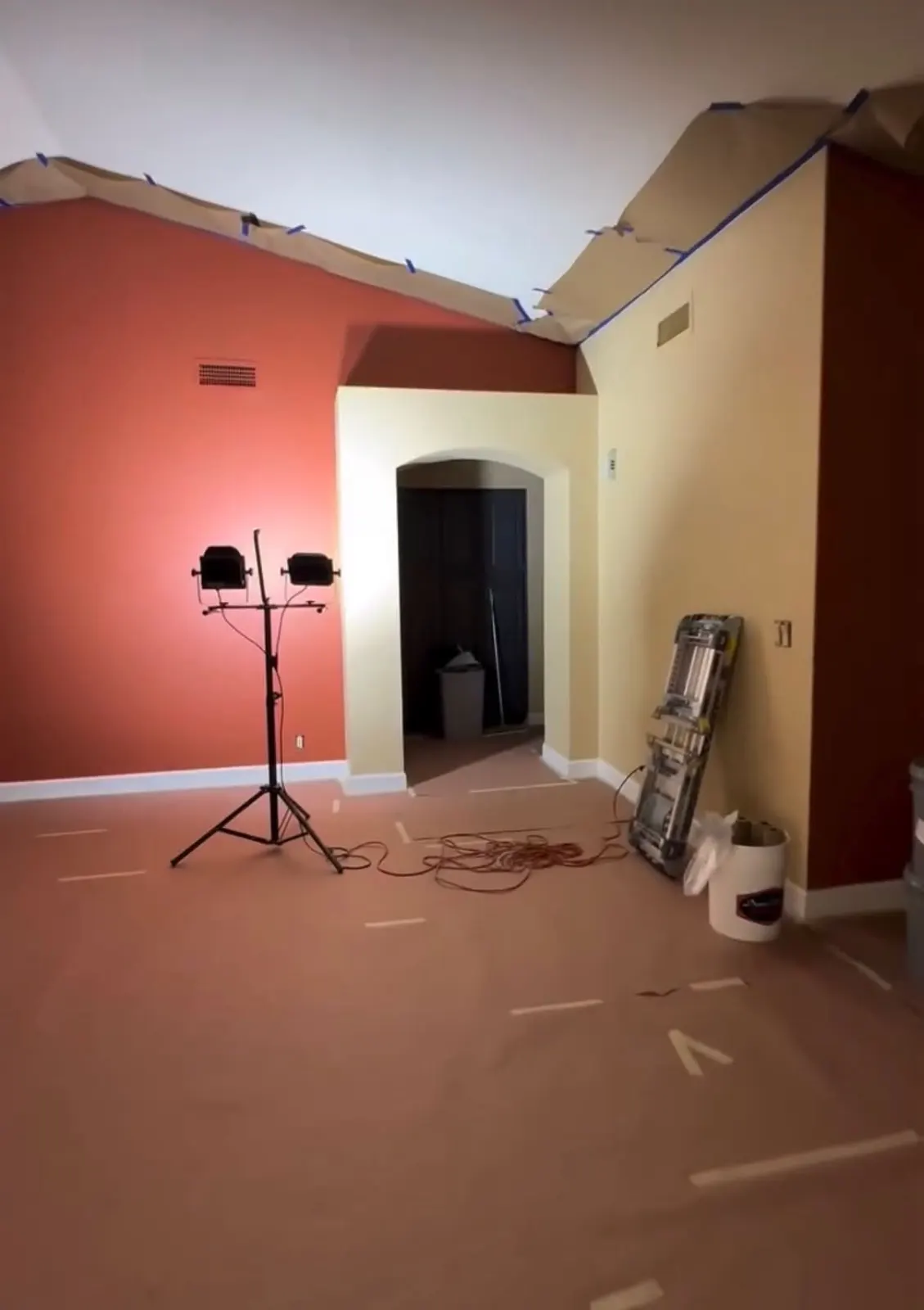
What shapes color choices in a desert home
Three things make West Valley interiors different from homes in cloudier places. The light is intense and warm for much of the year, so colors that look gray in a store can look warmer at home. Many houses built in the 2000s have beige, tan or travertine-look tile, and wall colors have to sit comfortably next to it. And open floor plans mean one wall color often runs through the kitchen, family room and hallways together.
That pushes most people toward light neutrals with a touch of warmth, which do not fight the floors and do not turn cold in the shade of a north-facing room.
Warm whites for walls, trim and ceilings
A warm white is the simplest way to brighten a house and is the usual choice for trim, doors and ceilings. In bright desert sun, a stark bright white can feel glaring; a white with a little cream or gray in it is easier on the eyes.
- Alabaster (SW 7008), LRV about 82: soft and creamy, a common whole-house trim and ceiling color.
- Greek Villa (SW 7551), LRV about 84: slightly warmer and brighter.
- Shoji White (SW 7042), LRV about 74: a white with more gray and body, good on walls.
Greige and warm gray: the everyday wall colors
Greige, a blend of gray and beige, is the bridge between older tan interiors and the cooler grays of newer builds. It works with warm tile and with gray plank flooring, which is why it fits so many local houses.
- Agreeable Gray (SW 7029), LRV about 60: light and flexible, reads warm in afternoon light.
- Accessible Beige (SW 7036), LRV about 58: a little warmer, good next to tan tile.
- Repose Gray (SW 7015), LRV about 58: a light gray with a hint of warmth.
- Worldly Gray (SW 7043), LRV about 57: soft and earthy.
- Mega Greige (SW 7031), LRV about 37: deeper, for a cozy den or an accent wall.
Muted greens that echo the desert
Soft sage and gray-green colors pick up the tones of desert plants outside the window, like palo verde, creosote and agave. They feel calm in bedrooms and offices and pair well with natural wood.
Sea Salt (SW 6204), LRV about 63, is a light green-gray that can look almost blue in shade. Clary Sage (SW 6178) and Svelte Sage (SW 6164), both with LRVs around 41, are more clearly green. Evergreen Fog (SW 9130), LRV about 30, is a deeper gray-green that works on a single wall or on a kitchen island.
Deep accents: charcoal, bronze and navy
Dark colors are usually used in small doses here: an accent wall, a powder room, interior doors, a fireplace surround or lower cabinets. Urbane Bronze (SW 7048) is a warm brown-charcoal, Iron Ore (SW 7069) is a soft near-black, and Naval (SW 6244) is a deep navy. Because they absorb light, they look best in rooms with good daylight or strong lamps, and they make a room feel smaller and cozier.
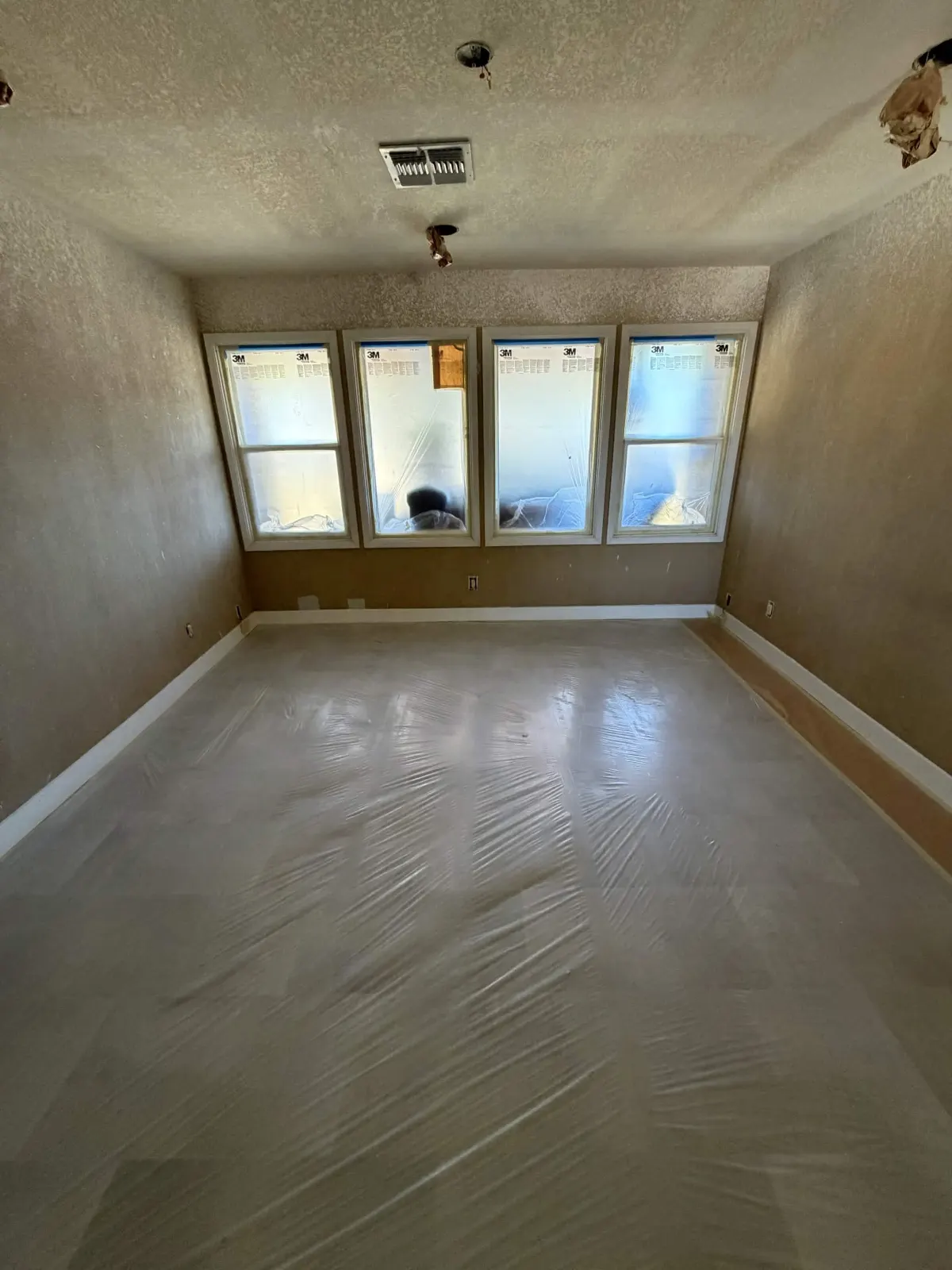
Moving on from the gold and brown era
Plenty of West Valley homes still have the warm golds, terracottas and deep tans that were common in houses built around the early 2000s, often with dark wood cabinets. Going straight to a cool gray in those homes can clash with the tile and wood. A warm greige or a creamy white is usually the easier transition, and it can make the existing floors look intentional instead of dated.
One palette for an open floor plan
Many West Valley floor plans run the entry, great room, kitchen and hallways together with no doors between them. Choosing a different wall color for each zone usually looks choppy, because you see several of them at once from the couch. A calmer approach is one main wall color for all the connected spaces, a single white for trim and ceilings, and changes of color only in rooms with doors, such as bedrooms, offices and bathrooms.
If you want variety in the open area, use the same color family at a different depth, for example Agreeable Gray in the great room and the deeper Mega Greige on a dining room accent wall. The colors relate to each other, so the house still reads as one design.
How to test colors in your own light
- Narrow your list to two or three colors from the same family.
- Paint large samples, at least a couple of feet square, on two different walls in the room.
- Look at them in the morning, mid-afternoon and at night under your own bulbs.
- Hold the samples next to your floor, countertops and trim color.
- Pick the one that looks right at the time of day you use the room most.
Frequently asked questions
- What is the most versatile wall color for an Arizona home?
- A light greige such as Agreeable Gray or Accessible Beige is hard to get wrong. It works with both warm tile and gray plank floors and stays balanced in strong sun and shade.
- Are gray walls still in style?
- Cool, blue-leaning grays have given ground to warmer greiges and whites. Gray is still common, but most people now choose versions with some warmth that look better in desert light.
- What color should trim and ceilings be?
- A warm white like Alabaster is a common choice for both. Using one white for trim, doors and ceilings throughout the house keeps everything tied together.
- Do colors look different in Arizona light?
- Yes. Intense, warm sunlight can make colors look lighter and warmer than the chip, and north-facing rooms can make the same color look cooler. That is why large samples on your own walls matter.
- Can I use a dark color in a small room?
- You can, and it often looks rich in a powder room or office. Expect the room to feel cozier rather than bigger, and make sure the lighting is good.